
 A couple months ago I was hired to paint the cover for a detective novel about an Armadillo detective. I obviously couldn't turn it down because that just sounded too fun. I've done a few covers in the past, but mostly for comic books, though the process isn't really different. The client has an idea, I sketch it out, he asks me to make changes until he likes how it looks, from there I paint the cover, turn it in, he asks for a couple minor changes, I fix it, and it's done!
I'd like to talk about how to get cover work. Most publishing companies nowadays like to save money, so covers are no longer painted, but are badly Photoshopped photos (or the rare good Photoshop job). They do this because it's cheaper and faster mainly. I have nothing against photo-manipulation at all. I see it as an art form in itself. It takes talent to do good, and it is used in almost every feature film you'll ever see. But for us illustrators, it's taking our jobs away. So some publishers are now seeing the value of digital painting. It's not as cheap as a quick Photoshop job, but not as expensive or time consuming as commissioning an oil painting. Don't get me wrong though, some publishers will commission an oil painting for a cover and I'm glad they do, because traditional illustrators need work too! All of the above applies mainly to novels and other books like that, not comics. Comic companies hire nothing but artists, from traditional to digital almost 100% of the time.
If you're looking to being a cover artist, there are a few things you should keep in mind. They say "You can't judge a book by it's cover.", not just because we shouldn't, but because we do all the time and were almost always guilty of it. Of course, after reading the book things change, but a cover that catches our eye pulls us to one book over all the others on the shelf. That's power. Power that you now have. Sadly, a cover could make or break a book. Major companies pay millions a year to make sure that their sign, logo, ad, commercial, etc. catches the eye and attracts customers. Publishing doesn't normally have that much to spend, so they'll usually just hire an artist that's good. Though, they do hire great editors that have an eye for what's good and what will sell a book.
One big that that separates some covers is color to no color. If you're going to be an illustrator, work with color. Or collaborate with someone who does. The color scheme alone could sell the cover. So know your color theory and study other covers to see what they do that looks good.
Another important thing to remember is it has to be finished. And what I mean by that is, the cover should not be a sketch. It should not be too messy. If it looks unfinished it will feel unfinished and the human eye will skip right past it. Think in details. Don't leave any important details unfinished. But also, you don't want to have too many details. A lot of times you'll paint something big, add the details, and it looks great, but when printed small, the details are lost and it just looks muddy. Also, too many details could confuse the human eye. You don't want them looking at your cover for too long trying to figure out what it is, but you don't want them looking at it too short so they lose interest and go on to the next book. You have to find a nice middle ground that makes them want to look at it, but still be able to tell what it is from across a room. The best covers are simple enough to understand right away, but complex enough to be intriguing.
Lastly, composition is VERY important. Always make sure there's room for a title and author credits. Some authors like Stephen King like their name REALLY big and the title, almost as big. So make sure there's room for that. Make sure the artwork flows with the title. In the west we read left to right, top to bottom. The same applies with art. In illustration, a lot of times we have to combine text with art. A comic page or a cover are no different. The art will catch their eye, but they'll read the title before looking more at the art usually. Make sure the art reads left to right, top to bottom (though it doesn't always have to). Make sure the composition shape and framing suit the book. Apply the rule of thirds whenever you can (for anyone who doesn't know what that is, it's a photography technique. I'll create a tutorial about it later one, but for now you can always Google it for more information.). Art is a universal language, but a language none the less. You have to be able to read it. You have to be able to see everything going on, but it should flow nicely. And by flow I mean your eye shouldn't be jumping randomly all over, it should go from one thing to the next. One trick to that is detailing only the important objects in a piece, and having less details in the unimportant parts. So your eye stays at the detailed parts longer, then moves faster across the undetailed parts to get to the other detailed parts. Little things like this you'll figure out and learn along the way.
There's a lot of money in covers and a lot of great illustrators make a career out of it. If that sounds like something that suits you, practice what I've mentioned above. Study other cover artists and see what they're doing that's working. I'd love to go to a book store and see more artwork on books. So keep drawing!
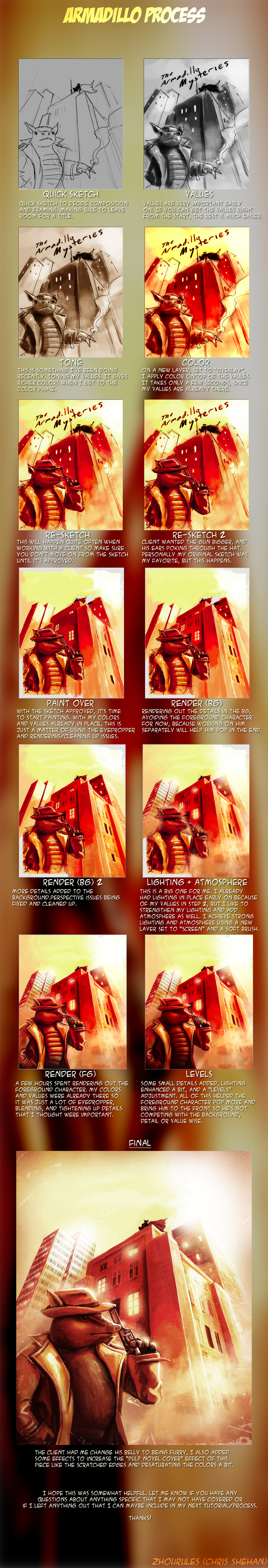
Here's a quick tutorial of the cover I did recently.
No comments:
Post a Comment