I haven't seen the new season of The Walking Dead, but I've read a lot of the comics and Michonne is by far my favorite character. Robert Kirkman is a creative genius and everything about The Walking Dead is amazing, but Michonne takes the cake. She is such a cool character. I love her history, I love her personality. Rick is alright. But Michonne is walking badassery. I hope I did her justice with this painting.
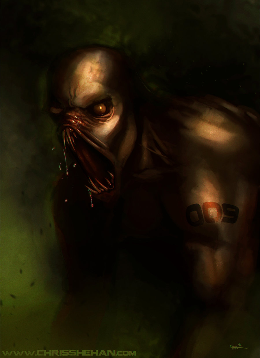
Never really tried my hand at creature design, other than a few attempts
here and there. I see some great stuff out there and I'd love to be
better at it. Here's a quick one. A few hours.
I've been messing around with finding a new painting process lately. Something that's more composition, color, and lighting focused rather than just straight up drawing/painting something. I believe that especially as an illustrator I like to convey a mood and a feeling in a piece. So I've been experimenting with that.
I wanted to test this process today on something pretty quick and I saw a photo of my Granddad posted online and knew I wanted to paint it. Him and his twin sister turned 89 recently. He's fallen off the roof before, and does situps every morning at 6am without fail. And he still likes to play pranks and joke around. Inspiration. I like doing portraits, I didn't have to take time figuring out composition or designing anything from my head. So it was definitely good practice. You can see the original photo below. This was good practice for me because I could change the lighting and mess with with the focus and use light and dark as a compositional tool. I'll probably be testing this painting process and "style" on future illustrations and portraits as well.
A lot of times I like to screen record my digital painting process so that way I can look back at it myself and also share my process with others in hopes that it'll help. I usually only record speedpaintings because that's only an hour or 2 of video, but sometimes I'll record full illustrations.
This piece is of the character Haunt, created by Todd McFarlane. He was holding a contest for Haunt and the winner would get published in an issue of the comic. I was lucky enough to make the top 15 semi finalists along with my friend Danny Morales, but we were both unable to make finals and get published. Either way I had a lot of fun doing this piece.
The reason I recorded this was because I wanted to show how I can paint something semi-realistic, without a "real" reference of this character. There's no Haunt movie or any realistic depictions of Haunt online so I had to improvise.
First of all, realism in art is ALWAYS based on the way light effects something. The better you can understand light, the more real you can make anything look. For example, look at any Pixar movie. They take cartoony designs and bring them into a 3D world with advanced lighting that makes the characters real and believable.
Secondly, different textures are effected differently by lighting. This is a common mistake I see all the time. People will light metal the same way they light cloth, the same way they light leather. For this piece, before I even started I had to think about what this character is made of. I came to the conclusion that all the white parts of his costume were made of rubbery, slimy, bone matter. I came up with "liquid bone" as a way to describe it. I wanted it to look like it's strong enough to protect him, but fluid enough to morph and change and wrap around him organically. To make this texture believable, I couldn't paint it the same as I painted his skin. Because his skin is not slimy or gross. If I painted his whole body like his skin, he'd look like a dull 3D model with simple lighting and no rendering or textures. So I studied slimy, shiny gross objects. You've got to do paint studies of textures you're going to use, because this way you can get an understanding of how it works with light before you go into your painting.
So really, realism "from your head" is as simple as understanding light, and how surfaces are lit. To get better at this just takes painting different textures/lighting scenarios from life. Trying to get the colors right and light the different textured surfaces right.
Here's an older speedpainting I did from mid 2011. I wanted to share this because this was one of my first attempts at some lighting & atmosphere techniques and I recorded the process. A few people have asked me about lighting and atmosphere so I figured I could talk a little bit about it here. I tried to put commentary on the video, but I couldn't figure out how to get it to work, but the video demonstrates it a little bit at the end.
I always try to get some sort of interesting lighting scheme. Sometimes I get realistic lighting, and sometimes I prefer to get what's called "stage lighting". Meaning you normally wouldn't see lighting like that in real life, but it works great for compositional purposes. For example, when you see a movie and a person's face is fully lit from all sides, yet so is the person they're talking to who's facing them. Where could that light possibly be coming from? Or to a more extreme level, when you play a video game and there's always a light in the direction that you're supposed to go. Where as in real life it might be harder to find that door to the next area. The lights are designed to lead your eye a certain way, lead your character a certain way, or set a mood. This is "stage lighting" because it's fake, believable light that serves as a compositional tool.
In the example above, I didn't necessarily have a purpose for the lighting, but it was more of a test to see if I could get some sort of mood and atmosphere with it. To achieve this I paint the character and the background in fairly flat, darker colors. Once the values are all there I use a "color dodge" layer in photoshop to paint some hot spots on the robot. I hardly use "color dodge" anymore and I don't recommend it unless it's used VERY lightly. After that I make a new layer and set it to "screen" and with a soft brush I start painting in light coming from the top right. "Screen" layers are GREAT for lighting and atmosphere. The reason is because a "screen" layer mixes the color you've chosen with the background, but also lightens the background and diffuses it as well. In real life, atmospheric perspective does the same things. Like when you see mountains that are far away, they are usually just a blue silhouette. The blue in the atmosphere mixes with the colors of the mountain and also the dark and light contrast fades away as well. After adding the lighting with the screen layer I then add a shadow layer set to "multiply". I pick a blue color for this to not only compliment the yellows and oranges, but to show the shadow is much cooler than the light. This happens in real life too, you'll notice a lot of times shadows have a blue or purple tint to them. "Multiply" layer is almost the exact opposite of a "screen" layer. It mixes colors with the layers below, but it darkens them. Great for shadows. This not only balances the composition but makes the light seem brighter and hotter than before.
Lastly, for added atmosphere, I always like to throw dust and particles into the atmosphere. Showing different levels of particles in the foreground, mid ground, and background gives the feeling of depth. Rain, snow, bubbles, dust, fire embers, all of these help make the subject matter seem like it's in a 3D plain rather than a 2D one.
So I hope that all helps! I'll do a more in-depth lighting tutorial later on so watch out for that. And last, but not least, here's the video of this painting.


 I've been messing around with finding a new painting process lately. Something that's more composition, color, and lighting focused rather than just straight up drawing/painting something. I believe that especially as an illustrator I like to convey a mood and a feeling in a piece. So I've been experimenting with that.


